 This project was about re-designing a festival microsite, in my case The Belladrum Tartan Heart festival: an eclectic music and arts festival aimed at a wide reaching target audience held annually (exception: Covid-19) in Inverness, Scotland. 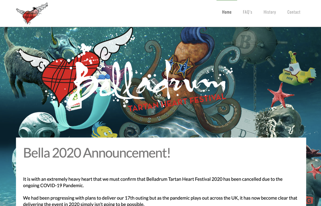 Current website (circa April 2020) The first step was to research the festival - to understand its attendants, what it offers, and what experience the 'users' gain from it. I hadn't heard of the festival before, so I did a lot of reading and found reviews and news articles which gave me a solid understanding. The current website was surprisingly not so informative - however this may be due to Covid-19 - and so found most of the festival photos, information on e.g. stages, acts and music via wikipedia and news websites. 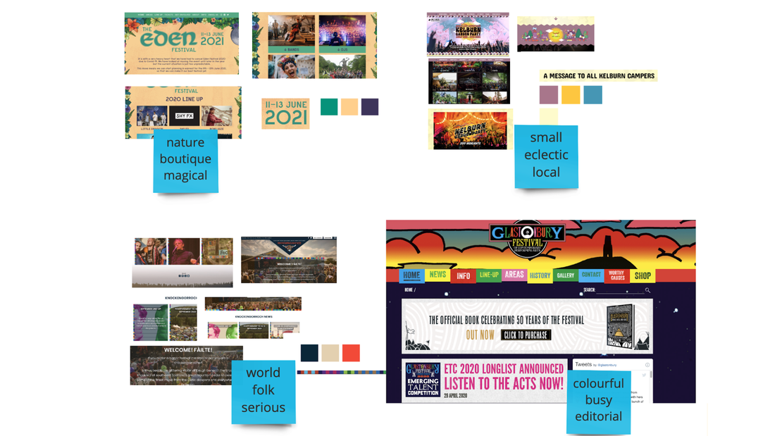 Visual Competitor Analysis I decided to compare (perceived) competitors by: festival size (attendants), brand attributes, target audience and location. The Visual competitor analysis helped to summarise the competitor festivals based on their branding and visuals so I could think about how I wanted Belladrum to differentiate itself. 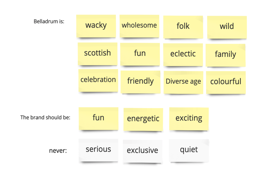 Brand attributes I also analysed the current branding of Belladrum and thought about how I wanted the brand to differ, or to be more cohesive, than it currently is. The Brand attributes list really helped with this, as it is a reminder of the direction I wanted to take. 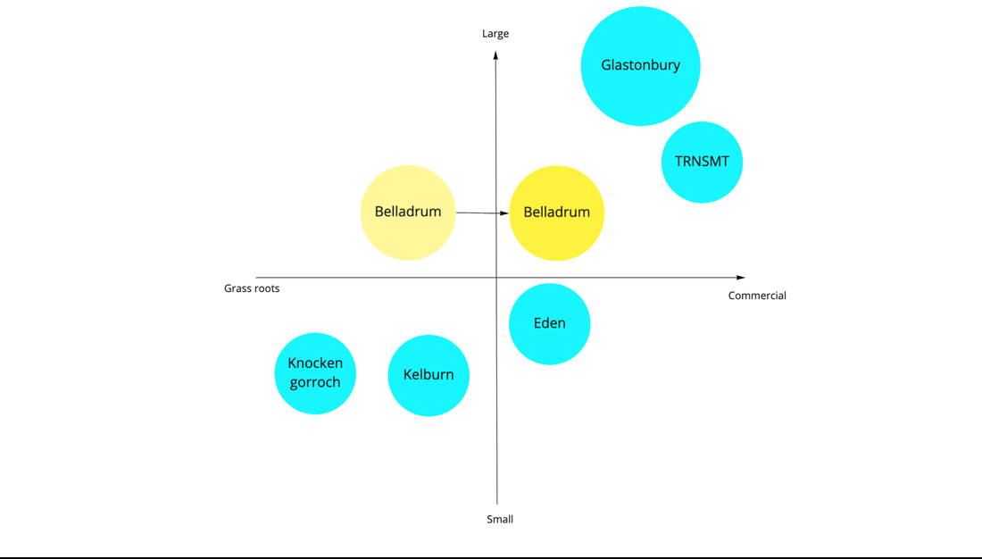 Brand Positioning Map With my visual competitor analysis and brand attributes done, I wanted to set a goal of giving Belladrum a more commercial appeal. It already attracts families and residents of Inverness, but I wanted to give it a re-brand to young adults who would otherwise maybe overlook it or think of it as too 'uncool'; at the same time I didn't want to lose their main target audience, so I had to carefully consider how to communicate the brand attributes. The brand positioning map helped me find a gap and differentiate it from more 'grassroots' festivals to reflect its mass appeal. Before continuing, I wanted to test the brand attributes with users, so I created a mood board and asked users to select the words that the images and colours brought to mind. 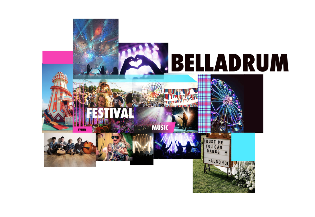 My Moodboard - used to test brand attributes Users defined the brand attributes as I had set them, so I moved on to creating style tiles: essentially just variations of how the site might look at a glance. I felt pretty confident with the type and colours used in the mood board so the style tiles were an easy progression. I had 3 options (2 very similiar) and re-designed their logo to match the new brand aesthetic. 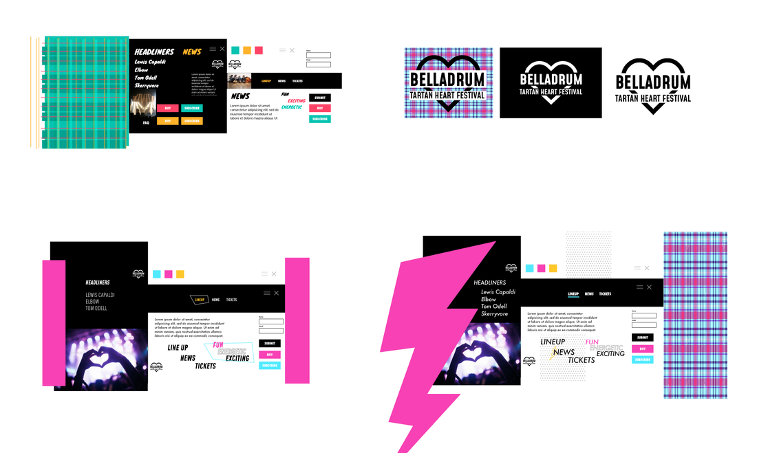 3 style tiles and logo re-designs I tested them with a very open questionnaire: Which do you like and why? Users preferred the bottom left style tile so I moved on. On reflection I would have given more thought to user testing; but I had 4 days to finish the whole project so had to pick and choose when and what to test. 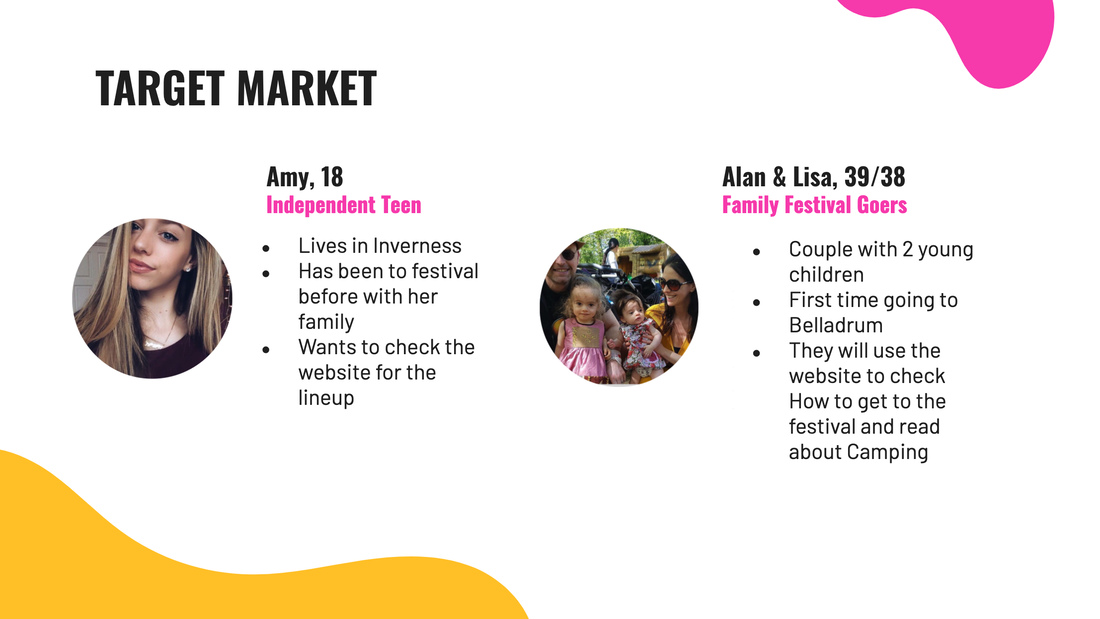 User Personas I created 2 user personas for this project because I really needed a strong point of reference for my design and to guide my user flows, and a reminder of the diversity of the Belladrum audience. I made 2 user flows: one for each persona:
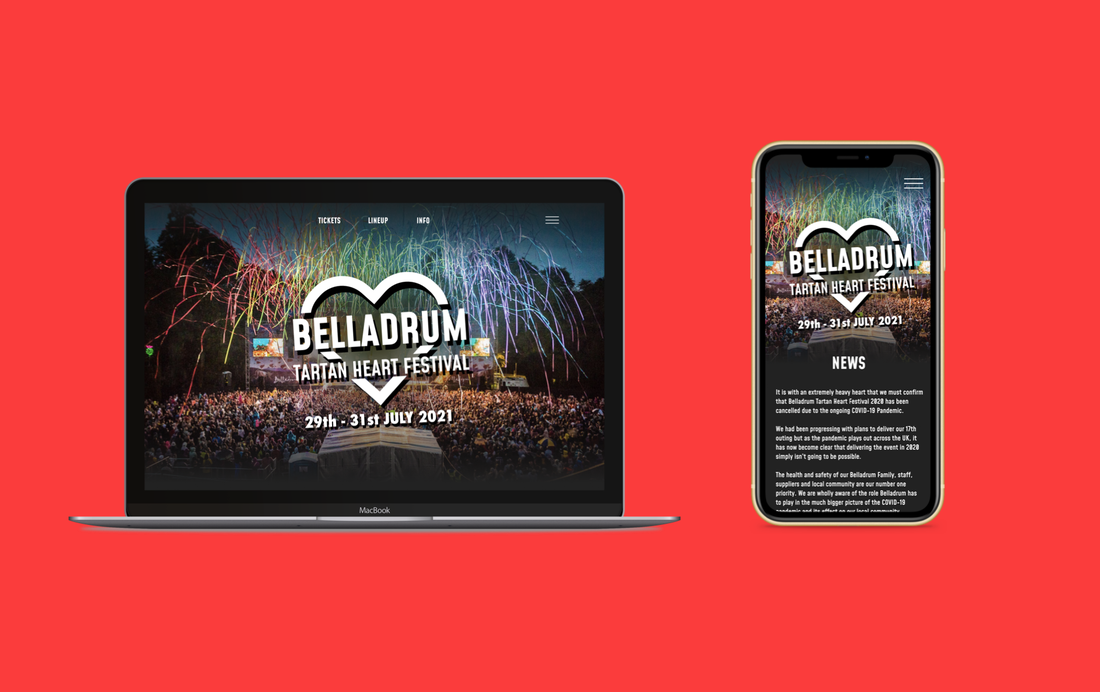
WireframesFrom there I made lo-fi then mid-fi wireframes which helped smooth out any issues before finalising. I did several iterations before finalising the screens for the final prototypes: a desktop and mobile version. 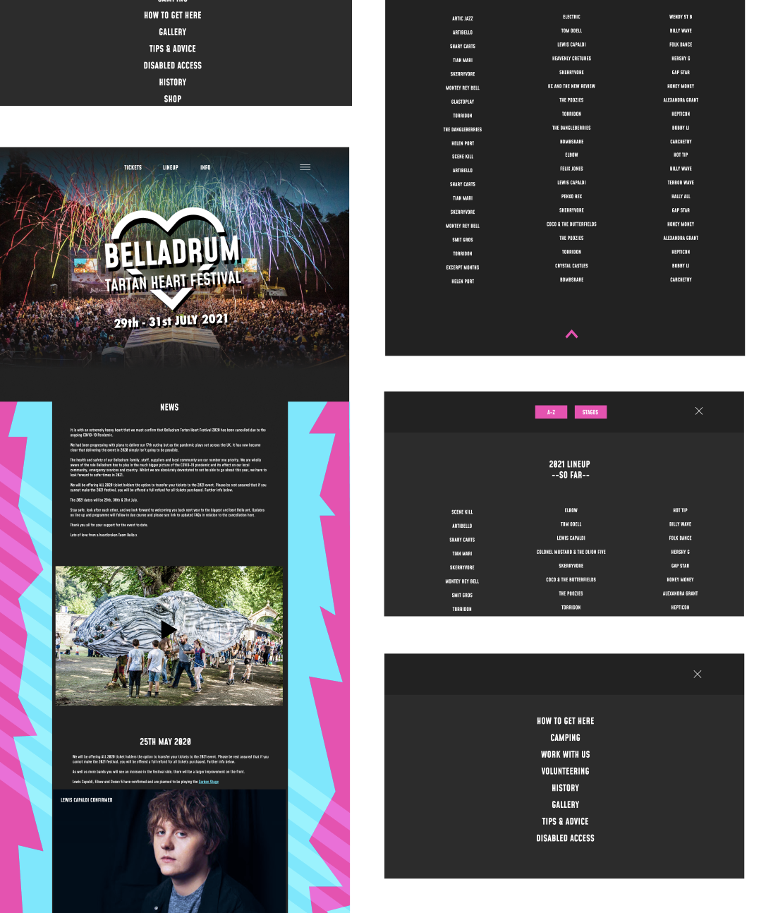 Final desktop screens The design was quite straightforward as it was well informed by user feedback and my research: it was clear that stages, lineup, tickets and a blog style news update were most important for users checking festival websites, so that was front and centre in the design. The burger menu had more detailed information based on what users may be looking for, e.g. Camping, volunteering, disabled access and so on. Part of this project was to design how the site would change during the festival and after the festival - so I designed alternative landing pages to reflect this 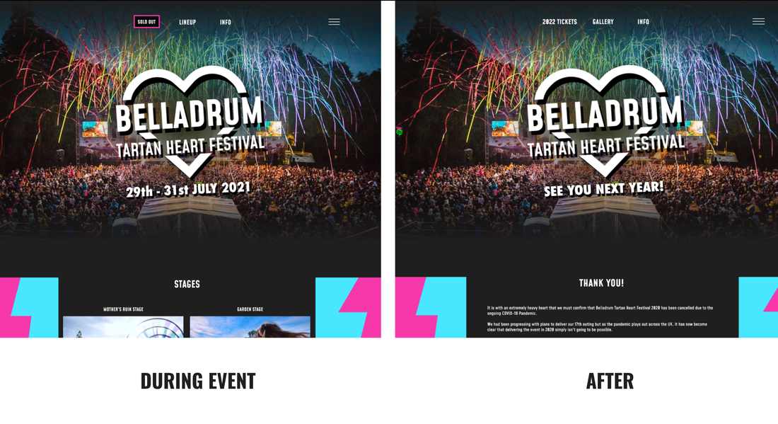 Small changes to the site helps build trust with users During the festival the user can see the stages and acts straight away - and the ticket option will be blocked (if sold out). After the festival the tickets will be available for the following year, the lineup is replaced with a link to gallery of photos and the content will prioritise a thank you message and lost and found. Final PrototypesI was satisfied with the overall result of this design challenge as I felt the re-design attracts a new audience without compromising the existing one.
Thank you for reading! Comments welcomed.
1 Comment
|
David LymburnArt, Design, Illustration, UX/UI and everything in-between Archives
December 2021
Categories |
 RSS Feed