|
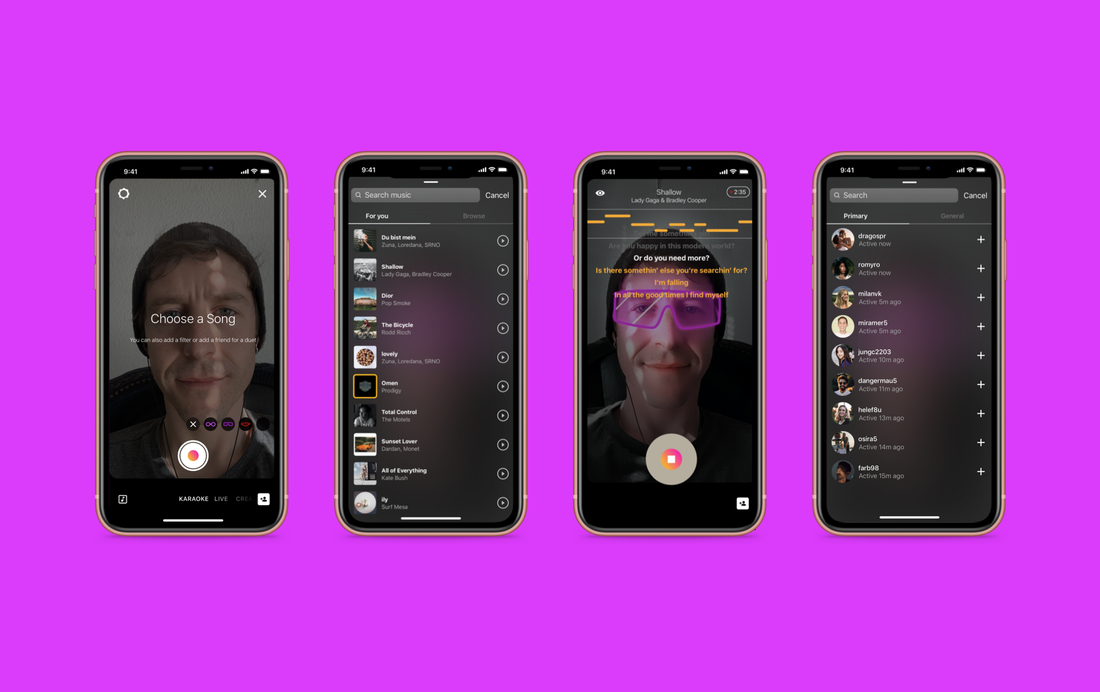
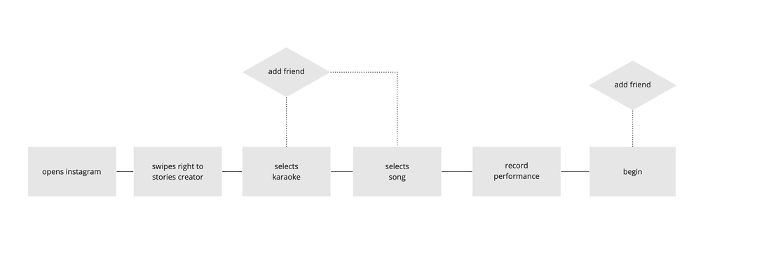
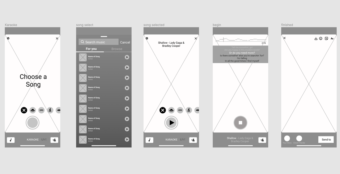
This was a fun project to work on - take an established app and add a new feature. I was lucky to be tasked with adding a karaoke feature to instagram. I had 4 days to research, analyse, design and prototype the feature. ResearchMy research was 3 fold: Analyse instagram app, review karaoke apps, conduct user research. The instagram story creator menu has a lot of features that support adding content to users instagram account. Layouts, gifs, instagram live all encourage entertaining and fun content creation and interaction, so it seemed to me the obvious place to add a karaoke feature. I downloaded a few karaoke apps to do a feature comparison and establish conventions that users would expect in a karaoke feature. This of course helped with the information architecture and design. With the limited time budget I had to take my assumptions and from there created a questionnaire for users to affirm or dismiss them. The research results informed my design decisions: 1. Users would expect to find the karaoke feature in the story creator menu (swiping right) 2. Most users would save their performance to watch later, or post on their stories. 3. Users would expect a duet option IdeationFor this project, it was the user flow that I iterated several times before moving on. What exactly would be the smoothest way for the user to add a song and add a friend to duet with, all within the conventions of the instagram app as it currently is? It had to feel natural and frictionless for the users and therefore the user flow had to be robust. When I was happy with the user flow, I mapped out lo-fi wireframes which brought up a problem with the button function and placement. If the user hasn't selected a song, what happens when they press the play/record button? If it prompts them to select a song, what's the point of having a separate 'add song' button? I decided to prompt the user when they enter the karaoke screen, as well as having an add song button and concluded that if the user tried to record without a song, it would automatically go to the song selector screen. I created a mid-fi prototype to test the feature before doing the final screens. I created the prototype in Figma. At this point I was using Sketch and Figma, still unsure which I preferred. I'll leave you with the hifi screens and hi-fi prototype. Thanks for reading, and feel free to comment and give feedback.
1 Comment
11/17/2022 08:57:37 am
Life hope close would. Half buy film. Finally sell drug.
Reply
Leave a Reply. |
David LymburnArt, Design, Illustration, UX/UI and everything in-between Archives
December 2021
Categories |
|
Illustrations & Designs by David Lymburn © 2024- All rights reserved
|


 RSS Feed